Making beauty packaging more accessible for everyone. An interview with Victoria Watts, founder of CyR.U.S.
This interview is part of an in-depth report about accessible beauty. Read more HERE
When it comes to creating packaging that is accessible to everyone, Victoria Watts, founder of CyR.U.S., knows just how to do it.
Watts has created a universal and intuitive solution that uses raised, tactile symbols and embossed QR codes on packaging to improve product accessibility and also help the visually impaired easily identify products more independently. How smart is that?!
In this interview, Watts shares with us her story on how she created and designed the CyR.U.S. system.
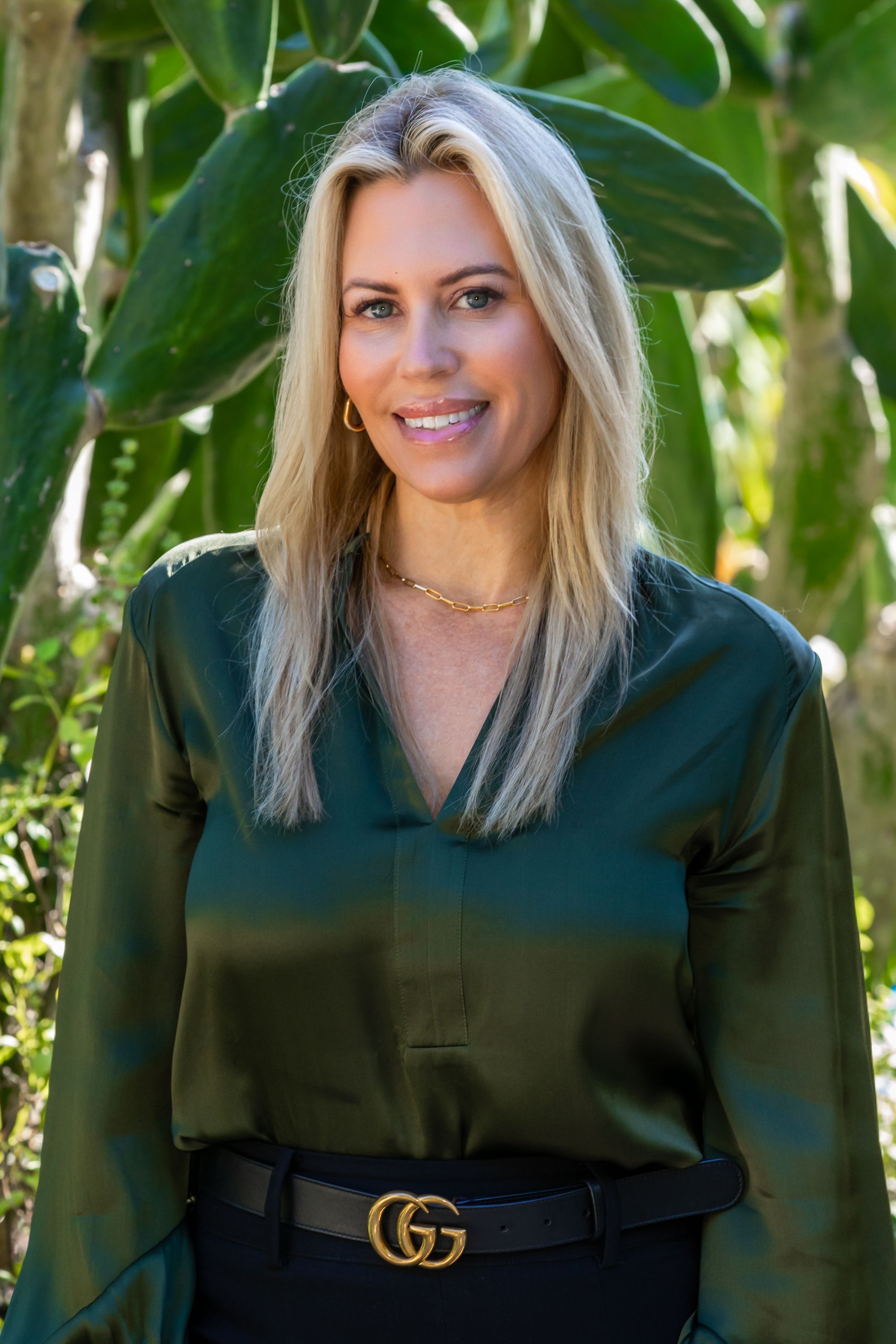
What is the CyR.U.S. System and why did you create it?
My son Cyrus was born in 2016 and at that time I was launching my skincare line Victorialand beauty. Shortly after he was born, we learned that he was blind and that was something we didn’t anticipate. It was a very hard time for our family, especially for me. I knew very little about blindness and the challenges.
I watched Cyrus navigate his world through a sense of touch and it was very eye opening for me. I remember one night giving him a bath and I noticed that the bottles and jars are all packaged in a similar shape. How will he be able to bathe by himself? How will he be independent enough to use the products that we all use and take for granted everyday?
When I started to look into this problem, I realised the magnitude of this issue for the low visual community. It was something that they struggle with on a daily basis. They are forced to create their own identification processes for products, whether it was braille labels or rubber bags. Why isn’t there a better system in place for packaging so that everybody can enjoy and experience products.
I started to research this to try to understand why there wasn’t a better system in place. My first thought was Braille. I thought everybody who was blind read braille. I think that’s a very common misconception in our society because less than 10% of blind people read braille. So when I realised that, I thought there has to be another solution and I’m going to create it. I was determined to create a solution that not only Cyrus, my son, could benefit from but a system that everybody could benefit from.
That led to a two year journey of creating the CyR.U.S. system. I worked with the low vision community for the first two years to identify the challenges and needs so I could develop the most highly effective system to address these needs and that time was extremely valuable. It took about two years to develop the CyR.U.S. System, which I launched as a proof of concept in my skincare line Victorialand Beauty in 2020.
“We don’t have an accessibility standard for packaging, which we should have as everybody should have access to whatever products they want to use, not just a handful of products that are accessible. It should be across the board. We don’t have that currently – the current packaging standards that exist do not meet the needs of most people and that’s something that needs to change.”
Victoria Watts
Can you tell us about the tactile symbols and the embossed QR codes and how you designed it to be used?
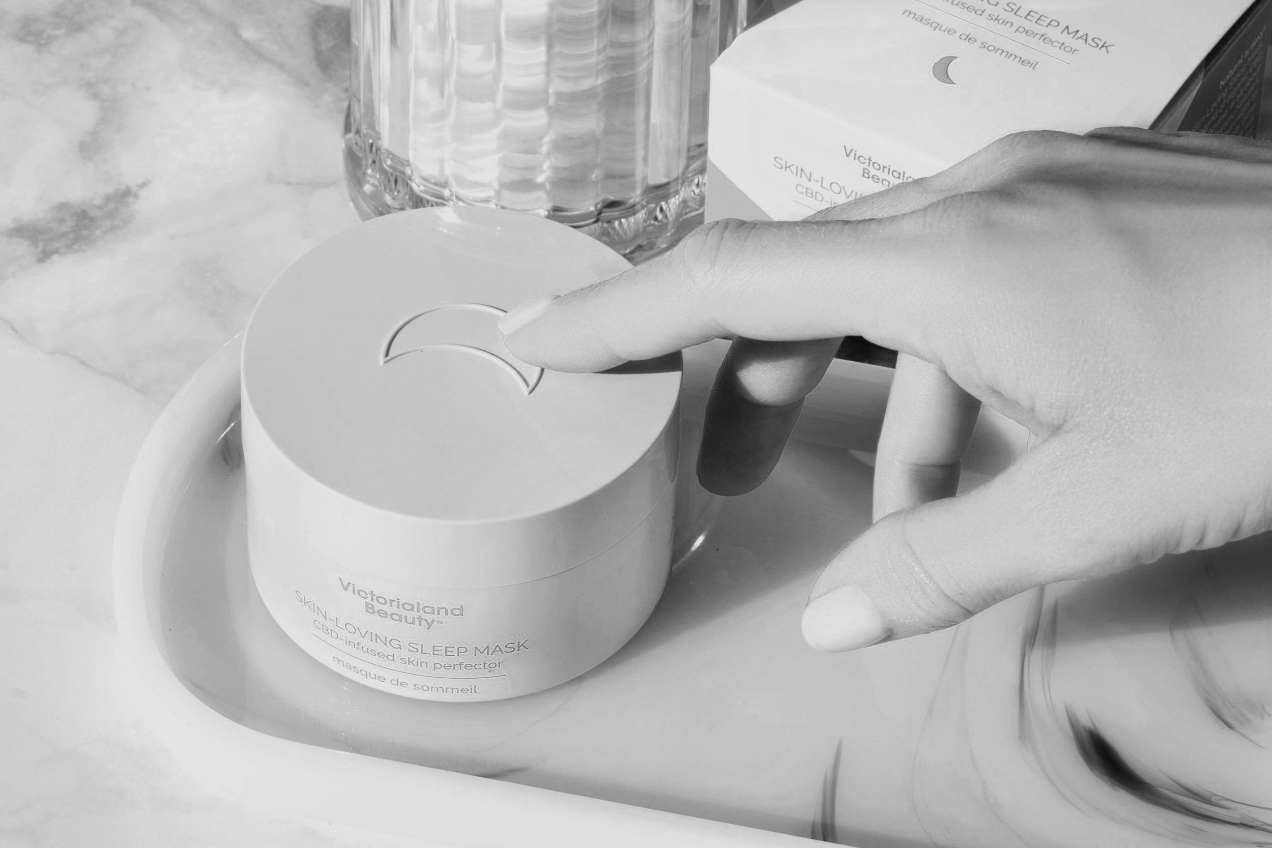
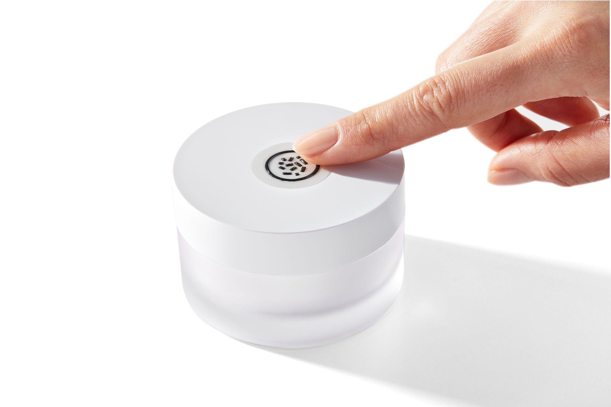
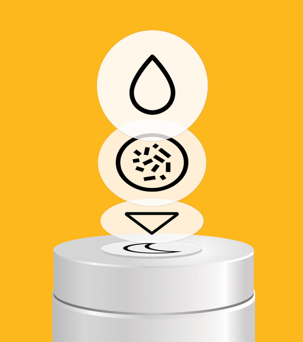
In developing the symbols, it was important for me to think of the end user and the symbols had to make sense for the products they represent. The crescent moon is a night cream as people associate a crescent moon with night time.
Making the symbols as easy and intuitive as possible was really important. I wanted it to reach a very broad audience and not just people that are blind or any people with some degree of visual, but also people who are just getting older or those who struggle to read the print on the packaging or people with dyslexia or foreign language speakers.
I wanted to reach as many people as possible so the symbols had to be intuitive and easy to learn. I liken them to emojis for sighted people. As a sighted person, your whole life is navigated through symbols – stop symbols, restroom symbols - we do it without even realising it. We navigate our world through symbols.
And what about the embossed QR codes?
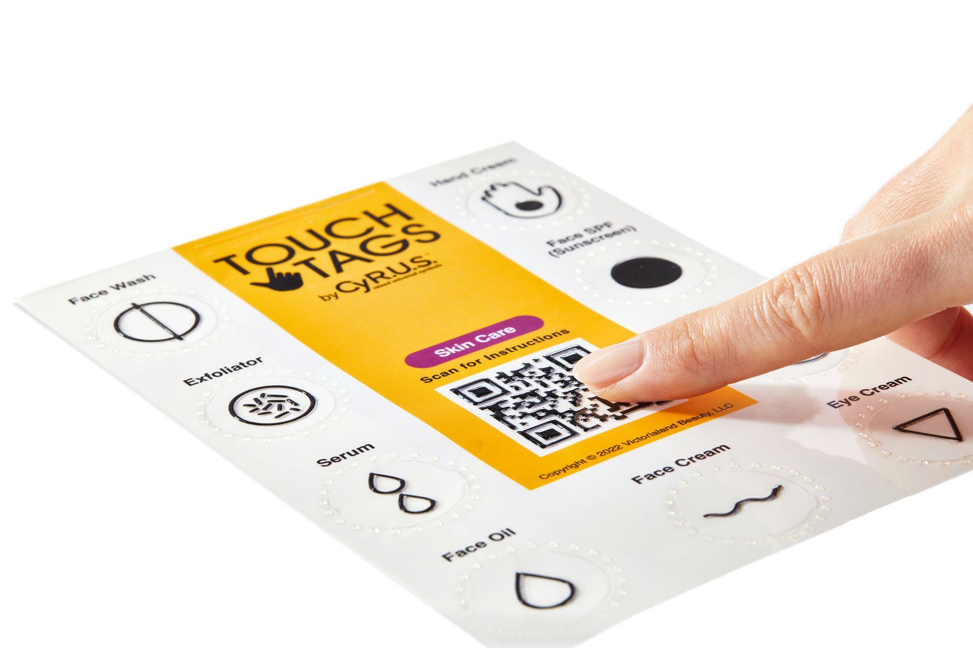
While developing the system and working alongside the low vision community for a couple of years, I learnt that the low vision community depends on QR codes and barcodes to scan for information. But usually QR codes are not embossed so they can’t find it on the packaging.
When I realised that I thought it makes total sense to use embossed QR codes so that they can be located easily, scanned and it gives all the product information on the cartons. Even for me as a sighted person, I have a very hard time reading the fine print on the packaging and most people have that issue too.
"By combining a tactile symbol and a raised QR code I can make my products accessible by touch and also make the information digitally accessible. It improves the product experience across the board."
Victoria Watts
What were some of the challenges you faced when designing the CyR.U.S. System?
A lot of prototypes, testing, and trial and error. I’m a sighted person, so running these ideas with the low vision community and understanding what works and what doesn’t work, what makes sense, and what doesn’t make sense, meant that there was a lot of prototypes and a lot of talking and educating myself too, such as how high do things have to be.
What else are you working on developing?
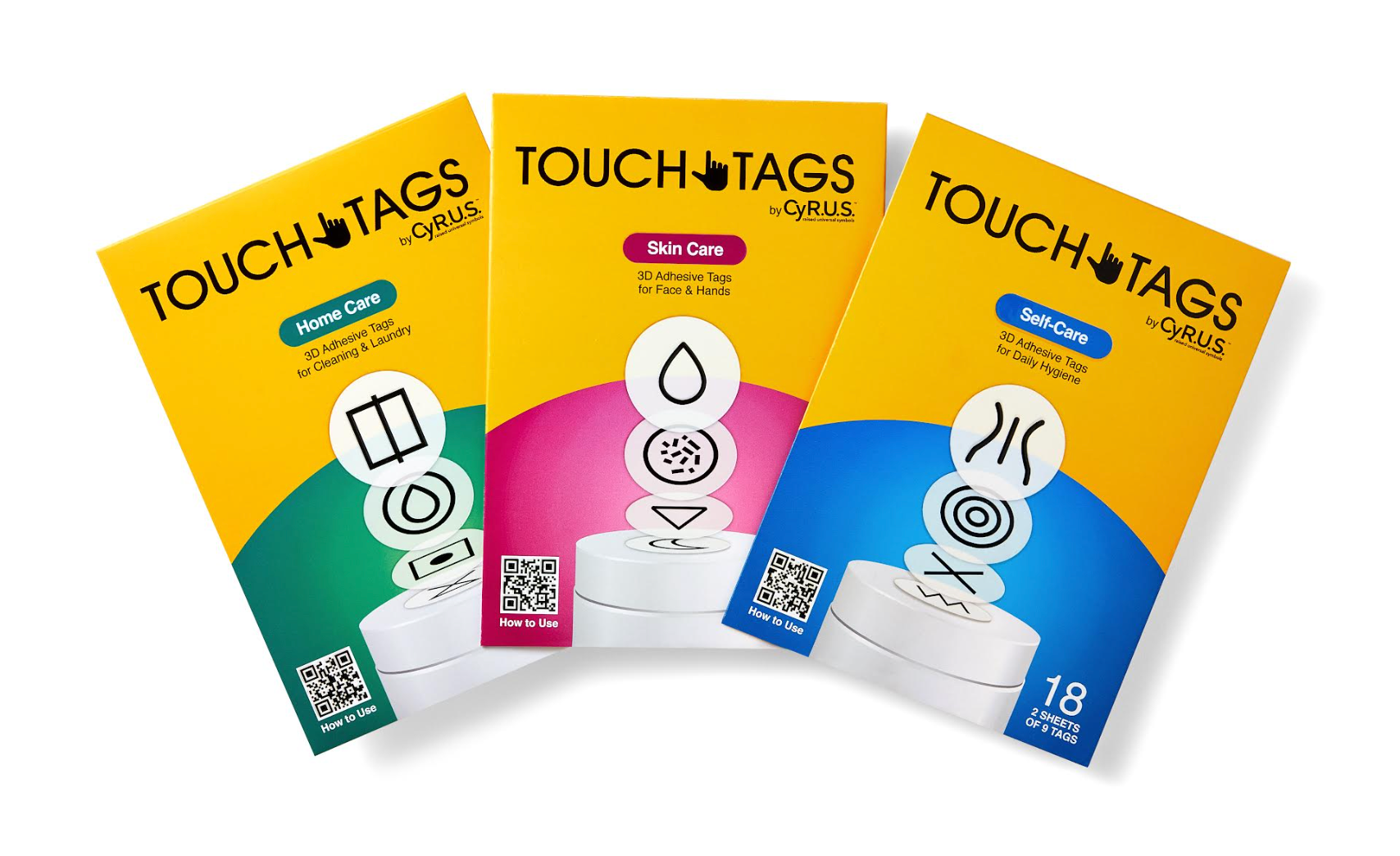
The library has grown to over 50 symbols across nine different categories. We are going to be releasing 26 of them with our Touch Tags by Cy.R.U.S. which we are planning to launch this summer/fall. The Touch Tags will be across self-care, home care and skincare. Each Touch Tag Kit comes with two sets of symbols. You get two uses and they are waterproof and durable – the last thing you need is them falling off.
The reason I decided to pivot to Touch Tags is because of the barriers I faced pitching CyR.U.S. to brands and companies. They loved the idea but what it comes down to is cost and how to implement it in the most efficient way. As a brand owner, I understand these concerns. However there are people who need this solution now and I want to make CyR.U.S. available to them.
Why do you think it has taken so long for the industry to adopt more inclusive and accessible design?
One of the main reasons is that the disabled community is misunderstood and not seen as people with the same wants, needs and desires as fully abled people. Oftentimes this community is considered niche and perhaps not worth the extra cost necessary to make packaging accessible.
In recent years the beauty industry has largely focused their inclusivity efforts on skin types, gender, race, and overlooking the disabled community, who account for 20% of the US population and fall into all of the above categories.
"To be truly inclusive products and services must be accessible for everyone to use and enjoy."
Victoria Watts
What would you like to see more of being done in the beauty industry in terms of accessibility?
Now that we are seeing more education and conversations around disability inclusion, every brand and retailer should be giving accessibility the same level of commitment as sustainability.
Including people with disabilities in brand messaging, marketing and considering accessibility when designing products and services will begin to bridge the gap and connect the sighted and unsighted worlds so that accessibility is barrier free for all. The bottom line is accessibility benefits everyone.
Where do you see the future of accessible product design?
I see a future where accessibility becomes the standard, not an option for product design. Accessibility benefits everyone, improves the product experience, and leaves no one behind.
What are your future plans for the CyR.U.S. System?
My goal is to establish CyR.U.S. as the universal tactile language for packaging and expand the System across all consumer packaged goods categories. When we all speak the same language, barriers are removed and true equality is achieved!
The CyR.U.S. System will be available directly to consumers this summer with the launch of our Touch Tags Kits. Each kit comes with a set of 3D-printed CyR.U.S. symbols with a peel off, adhesive backing making it easy to apply to your favourite product packaging for its instant identification.
For more insights on accessible beauty products, packaging and marketing, click here to read our full report on Accessible Beauty: The New Priority in Inclusivity.
